Creating accessible content is essential for ensuring that everyone, regardless of ability, can read, understand, and engage with the material. When designing documents, whether they’re reports, guides, or newsletters, accessibility should be a top priority. To begin, it’s important to use clear and simple language that avoids jargon or overly complex phrases. Short, straightforward sentences improve readability, especially for individuals with cognitive impairments or non-native English speakers. Additionally, using proper paragraph structure helps organize ideas logically, making the content easier to follow.
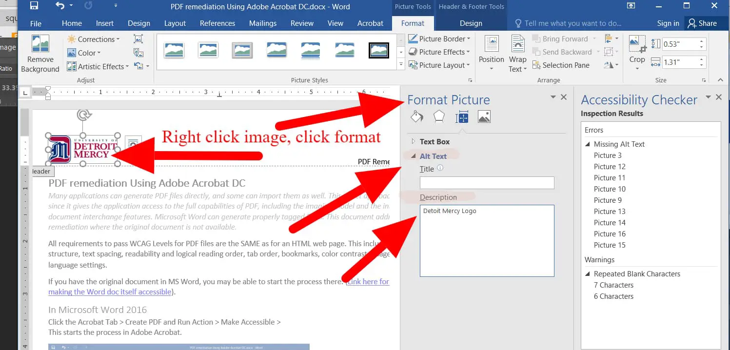
A good practice is to limit paragraphs to a few sentences, each focusing on a single point. For example, instead of overwhelming the reader with large blocks of text, break up the content into manageable chunks that convey one idea at a time. It is also crucial to ensure that any images, charts, or tables used in the document are accompanied by descriptive alt text to make them accessible for screen readers. The goal is to enhance clarity and usability by formatting content with proper headings, line spacing, and font sizes that are easy to read. Opt for simple sans-serif fonts like Arial or Calibri at sizes no smaller than 12pt, and use line spacing of 1.5 or double spacing to make text more readable. Avoid justified text alignment as it can create irregular spacing between words, which can be hard to read, particularly for individuals with dyslexia or other reading difficulties. Finally, ensure that hyperlinks are descriptive and clearly indicate where they lead, such as "Read more about our services" instead of "Click here." By following these simple but effective guidelines, documents become more accessible to a wide audience, ensuring that content is inclusive for everyone.

